 Skip to content
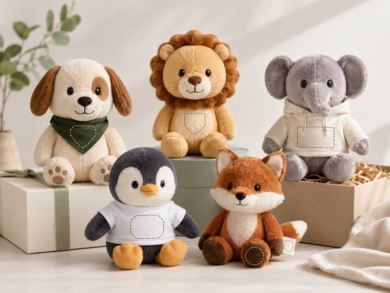
A brand mascot plush toy is not just a soft product with a logo attached. It is a small character that may sit on a retail shelf, appear in an event photo, travel inside a gift box, or stay on someone’s desk for years. This is why logo placement is more sensitive than many teams expect. Place the logo too aggressively, and the plush may feel like a throwaway promotion. Place it too quietly, and the brand disappears when the toy is photographed, displayed, or shared.
The best logo placement on a brand mascot plush toy is the position where the mark stays readable, feels natural to the character, avoids heavy distortion, and can be repeated consistently during bulk production. Common strong choices include T-shirts, scarves, belly panels, chest panels, foot pads, side woven labels, hang tags, and branded packaging.
A plush mascot works best when people notice the character first and the brand second. Think of a sports mascot wearing a tiny jersey, a coffee shop bear holding a branded cup, or a school tiger with a scarf. The logo is present, but it belongs there. That small design decision can decide whether the toy feels collectible or simply decorated.
Why Does Logo Placement Matter?
Logo placement matters because a mascot plush toy is built from soft, curved, filled, and touchable surfaces. A logo that looks clean on a flat design file may bend after stuffing, sink into long fur, hide under an arm, or feel too stiff when held. The right placement keeps the mascot lovable while making the brand mark clear, durable, and suitable for repeated bulk work.
A mascot plush is different from a paper card, a box, or a flat textile item. It has a face, posture, seams, curves, stuffing pressure, fur direction, accessories, and a real hand feel. These details change how a logo appears after the toy is sewn and filled. A centered logo in artwork may move upward after the belly becomes round. A print that looks sharp on a smooth file may lose its edge on textured fabric. A beautiful embroidered mark may become too thick on a small paw or ear.
Good logo placement protects three things at the same time: the character, the brand mark, and the final product experience. If the logo takes over the face or body, the mascot can lose charm. If the logo is too small or placed in a hidden area, it may not be noticed in photos, retail display, event tables, or gift kits. If the position is technically unstable, the sample may need several revisions, and bulk consistency may become harder to control.
A strong placement decision usually considers:
- Plush size
- Body shape
- Sitting or standing posture
- Fur length
- Seam position
- Logo detail level
- Viewing distance
- Hand-touch area
- Label and tag needs
- Packaging style
- Bulk quantity
- Final use scene
For example, a 15 cm mini mascot with long fur may not suit a detailed belly logo. A 30 cm seated bear with short foot pads may carry a small embroidered icon beautifully. A sports mascot may look natural with a jersey logo, while a premium character gift may look better with a small side label and a strong hang tag. The best position is not always the most visible one. It is the one that fits the whole product.
What Is Logo Placement?
Logo placement means choosing where a brand mark, character name, campaign symbol, club badge, school crest, or identity label appears on a mascot plush toy. It may be placed directly on the plush body, on a clothing piece, on an accessory, inside a seam, on a hang tag, or on the package.
Common placement areas include:
- Chest panel
- Belly panel
- Foot pad
- Inner ear
- Back body
- Shirt or hoodie
- Jersey
- Scarf
- Cap
- Mini backpack or bag accessory
- Woven side label
- Care label
- Hang tag
- Story card
- Gift box
- Drawstring pouch
- Retail display card
The logo does not always need to appear directly on the plush body. In many well-designed mascot projects, the plush body stays clean while clothing, tags, labels, or packaging carry the clearer identity mark. This keeps the toy soft and attractive while still giving the brand enough visibility.
Logo placement also decides the decoration method. A foot pad may suit embroidery. A shirt may suit printing or embroidery. A side seam may suit a woven label. A box may suit full-color printing. A scarf may suit a small patch. Each location has its own technical behavior.
A useful way to plan placement is to divide logo use into three levels:
| Logo Level | Main Role | Common Position |
|---|---|---|
| Primary mark | Easy recognition | Shirt, scarf, chest, belly, package |
| Subtle identity | Long-term product detail | Foot pad, side label, back label |
| Information area | Story, QR code, barcode, care note | Hang tag, story card, box, label |
This prevents the plush from becoming crowded. A mascot toy does not need five loud marks. One clear visible area, one subtle label, and one information area are often enough.
Why Does Visibility Matter?
Visibility matters because mascot plush toys are often seen in many different situations: on a desk, in a gift box, in an event photo, on a retail shelf, inside a school store, at a team booth, or in a social media post. A logo that can only be read in a close-up photo may not work well in real use.
A practical visibility check should include distance, angle, posture, and lighting. A plush may look different when standing, sitting, squeezed, held in the hand, or packed inside a box. The logo should be checked in the same way people will actually see the toy.
| Use Scene | Viewing Distance | Better Logo Style |
|---|---|---|
| Hand-held gift | 20–40 cm | Small embroidery, foot pad, side label, neat tag |
| Desk display | 50–80 cm | Shirt, scarf, chest, belly, strong color contrast |
| Event table | 1–2 m | Front clothing logo, scarf logo, larger simple mark |
| Group photo | 1–3 m | Clean front-facing mark, high contrast, simple shape |
| Retail shelf | 1–3 m | Packaging, hang tag, foot pad, visible outfit |
| Online product photo | Close-up and full view | Balanced logo plus clean character details |
Visibility should never be judged by logo size alone. A large logo can still fail if it sits on long fur, curves around the belly, or blends into the fabric. A smaller logo can work very well if it is placed on a high-contrast scarf or a flat shirt panel.
Color contrast also matters. A dark blue logo on black plush may look elegant up close but disappear in photos. A white logo on a cream belly may look soft but lack strength from a distance. For event and retail use, the mark usually needs enough contrast to remain clear under mixed lighting.
The safest test is simple: place the logo at real size on the plush outline, step back one meter, and take a phone photo. If the logo is hard to notice in that quick photo, it may not perform well during real use.
How To Design A Brand Mascot?
A strong brand mascot should be easy to recognize, pleasant to hold, and practical to turn into a soft toy. Before deciding logo position, the mascot itself should have a clear structure. If the character is too complex, logo placement becomes harder. If the body has no clean area, every logo choice may feel forced.
Good plush-ready mascot design often includes:
- A clear head shape
- A simple facial expression
- Strong color areas
- Balanced arms and legs
- Enough body space for clothing or a small mark
- One memorable accessory
- A posture that suits display
- Soft parts that can be safely sewn and filled
A mascot with a round body and open front area may suit a shirt or belly logo. A mascot with detailed front markings may need a side label or tag instead. A mascot with a strong outfit can place the logo on that outfit. A mascot with a signature accessory, such as a scarf, cap, backpack, medal, or tiny product prop, can use the accessory as the main identity area.
The face usually deserves the most protection. Eyes, mouth, nose, cheeks, brow shape, and head proportion create emotional connection. Placing a logo near those areas can make the toy feel less natural unless the logo is part of the character story.
For mascot plush, simple shapes often perform better than overly detailed artwork. A shape that looks plain on screen can become charming after soft fabric, filling, and embroidery. A highly detailed illustration may lose clarity when reduced into fabric pieces. This is why plush design should not simply copy flat artwork. It should translate the mascot into a soft, dimensional, touchable form.
What Makes A Good Mascot Logo?
A good mascot logo should stay recognizable after it is reduced, stitched, printed, woven, or placed on a curved textile surface. A logo designed for a website, poster, or box may not automatically work on plush. Tiny lines, thin letters, gradients, shadows, and dense badge shapes often become unclear on fabric.
For plush use, the best logo marks usually have:
- Simple outline
- Strong contrast
- Clear letter spacing
- Limited fine detail
- Few color changes
- A version without tiny slogans
- A simplified icon for small areas
- A full version for tags and packaging
The logo may need different versions for different placements. A full logo can work on a hang tag, gift box, or shirt. A shortened wordmark may work on a scarf. A simple icon may work on a foot pad or woven side label. This system allows the plush to look cleaner while keeping the identity consistent.
| Logo Detail | Risk On Plush | Better Adjustment |
|---|---|---|
| Tiny slogan | Becomes unreadable | Move to hang tag or story card |
| Thin line icon | May disappear in embroidery | Thicken the stroke |
| Gradient | Hard to reproduce with thread | Use solid colors |
| Complex badge | Looks crowded at small size | Use patch or packaging |
| Long wordmark | Needs too much width | Use shorter version |
| Low contrast colors | Hard to see on fabric | Adjust color or surface |
| Very small registered mark | May become a dot | Place on printed tag if needed |
A good mascot logo does not need to overpower the toy. It should feel like it belongs to the character. A small crest on a jersey, a tiny mark on a scarf, or a clean symbol on a foot pad can feel more valuable than a large logo covering the plush body.
Actual-size review is important. A logo that looks clear at 100 mm wide may fail at 30 mm. Before sample work, the logo should be printed at the intended size and placed on the plush drawing. If it is already hard to read on paper, it will not become clearer on fur.
Is A Big Logo Always Better?
A big logo is useful only when the plush needs strong public visibility. For example, event giveaways, school spirit toys, sports mascots, campaign gifts, and staff gifts may benefit from a larger logo on a shirt, scarf, jersey, or belly panel. These products are often seen quickly, photographed from a distance, or handed out in busy spaces.
For retail plush, premium gifts, mascot IP, and collectible-style products, a large logo may weaken the toy’s appeal. People often keep plush toys because of softness, cuteness, character, and memory. If the logo feels too dominant, the plush may lose emotional value.
The better question is not “How large can the logo be?” but “How much branding does this plush need to feel complete?”
| Product Role | Logo Size Direction | Better Placement |
|---|---|---|
| Event handout | Medium to large | Shirt, scarf, chest, belly |
| School mascot | Medium | Jersey, scarf, foot pad |
| Sports team plush | Medium to bold | Jersey, cap, back name, scarf |
| Retail plush | Small to medium | Foot pad, side label, hang tag, packaging |
| Premium gift | Small and refined | Foot pad, woven label, tag, gift box |
| Character IP plush | Subtle | Label, story card, package, small accessory |
| Mini keychain plush | Very simple | Small icon, woven label, tag |
Size should also follow plush scale. A 50 mm logo may look balanced on a 30 cm plush but too heavy on a 12 cm plush. A 20 mm icon may work well on a mini plush but feel too weak on a large display toy. If one mascot will be produced in several sizes, each size may need a different logo width.
A useful planning reference:
| Plush Height | Suggested Visible Logo Width |
|---|---|
| 8–10 cm | 10–20 mm |
| 12–15 cm | 18–35 mm |
| 18–25 cm | 30–60 mm |
| 30–45 cm | 50–100 mm |
| 50 cm+ | 80 mm+ depending on surface |
These are starting references, not fixed rules. Logo detail, method, fabric, and position can change the final size. A simple icon can be smaller than a long wordmark. A patch may need more space than embroidery. A printed shirt can often hold more detail than a fur body.
Are Mascot Details More Important?
Mascot details are often more important than the logo because they create the reason people want to keep the toy. A plush mascot is remembered through its face, shape, posture, colors, and personality. The logo supports identity, but the character carries the emotion.
Key mascot details include:
- Eye position
- Mouth shape
- Nose size
- Ear angle
- Head proportion
- Belly shape
- Paw design
- Tail shape
- Clothing fit
- Signature accessory
- Sitting or standing posture
- Color contrast
When these details are strong, the logo can be more restrained. A mascot with a recognizable face and outfit may only need a small scarf logo, a woven label, and a tag. A new mascot with less recognition may need a clearer clothing logo or stronger packaging.
Logo placement should avoid damaging the emotional center of the toy. The face is usually the most sensitive area. The belly can also be sensitive if it is part of the mascot’s character shape. Hands and paws may be touched often, so a stiff patch in that area may feel uncomfortable. The back can be useful, but it should not be the only visible brand area if the plush will sit facing forward.
A good plush mascot balances five values:
| Value | What It Means For Logo Placement |
|---|---|
| Character charm | Do not cover important expression or body shape |
| Readability | Keep letters and icons clear at actual size |
| Softness | Avoid stiff decoration in high-touch areas |
| Display value | Make sure the mark can be seen in real use |
| Bulk consistency | Use positions that can be repeated cleanly |
The most successful placement often feels invisible in the best way: people notice the toy first, then realize the brand mark fits naturally. A scarf logo looks like part of the outfit. A jersey logo feels like part of the team story. A foot pad mark feels like a signature. A side label feels like a finished product detail.
When logo placement respects the mascot’s design, the plush feels more complete, more memorable, and more likely to be kept. That is the real value of careful placement.
Which Logo Position Works Best?

The best logo position depends on plush size, body shape, sitting posture, fur length, logo detail, product purpose, and the way the toy will be displayed or handled. Strong logo areas include clothing, scarves, chest panels, belly panels, foot pads, side labels, hang tags, and packaging. A good position keeps the logo visible, balanced, soft, secure, and easy to repeat in bulk.
A mascot plush toy has more placement limits than a flat product. The body is curved. The surface may be fluffy. Arms may cover part of the chest. A belly may round out after stuffing. A foot may face slightly upward or sideways. A scarf may shift under the chin. A tag may cover the face if it is attached in the wrong place. These details may look small during design, but they can change how the finished toy feels and photographs.
The strongest placement is usually not the largest blank area. It is the area where the logo can stay readable without hurting the character. For a fun event plush, a visible shirt logo may work well. For a retail collectible, a foot pad or woven label may feel more polished. For a sports mascot, a jersey, scarf, or back number can look natural. For a premium gift, a subtle label plus an elegant tag may be better than a bold front logo.
Before choosing a position, the project team should think about four practical things:
- Will the logo be seen when the plush sits naturally?
- Will the logo stay clear after sewing and stuffing?
- Will the logo feel comfortable when held?
- Will the same position stay consistent across all pieces?
A plush toy may use more than one logo area, but each area should have a clear job. One position may carry the main visible mark. Another may carry a quiet identity label. A hang tag or box may carry the longer story, QR code, barcode, or care details. This gives the plush a clean look without losing recognition.
| Logo Position | Visibility | Best Use | Main Risk |
|---|---|---|---|
| Chest | High | Front-facing mascot identity | Arms or curve may cover part of it |
| Belly | High | Cute animals, soft character style | Logo may stretch after stuffing |
| Shirt | High | Event gifts, school mascots, teams | Clothing fit must be controlled |
| Scarf | Medium to high | Seasonal, friendly, warm designs | Logo may hide under chin |
| Foot pad | Medium | Retail plush, keepsakes, collectibles | Not visible from every angle |
| Ear | Low to medium | Small icons, cute details | Limited space and curved surface |
| Back | Medium | Jerseys, hoodies, capes | Not visible in front display |
| Side label | Low | Subtle identity and care details | Too small for complex logos |
| Hang tag | Medium to high | Story, QR code, barcode, collection info | Poor attachment can block the face |
| Packaging | High | Retail, gift sets, display programs | Plush itself may need subtle identity too |
Chest vs Belly
Chest and belly placement are popular because they face forward and can be seen quickly. They work especially well on bears, rabbits, cats, dogs, school mascots, sports characters, and rounded animal plush toys. These areas are familiar to people because they resemble where logos appear on shirts, jerseys, badges, and soft goods.
A chest logo feels more active and official. It is suitable for mascots wearing T-shirts, hoodies, uniforms, vests, or jerseys. It can work well for sports teams, school programs, corporate mascots, event plush, and character launch gifts. Since the chest sits near the face, it can create strong recognition, but it should not compete with the eyes, mouth, or signature facial details.
A belly logo feels softer and more playful. It often suits animal plush with a light-colored belly panel, such as bears, pandas, rabbits, foxes, penguins, and fantasy animals. A belly logo can look friendly because the area is larger and lower than the face. It may also feel less formal than a chest badge.
The challenge is distortion. A plush belly is rarely flat after filling. It may round outward, making letters curve slightly. A circle may become slightly oval. A long wordmark may bend around the shape. If the belly fabric has long fur, the logo may sink into the surface. If the belly is too soft, printed or stitched details may wrinkle.
For cleaner results, chest and belly logos work best when:
- The logo is simple and not too wide
- The surface is short-pile or smooth fabric
- The placement avoids seams and darts
- Arms do not cover the design
- The plush has enough front body height
- The sample is reviewed in seated and standing posture
| Plush Size | Chest/Belly Logo Suggestion |
|---|---|
| 8–10 cm | Use icon only, avoid small text |
| 12–15 cm | Short wordmark or simple mark |
| 18–25 cm | Shirt, chest, or belly logo can work |
| 30–45 cm | More detail possible, still check curve |
| 50 cm+ | Larger front logo possible with placement control |
If the mascot’s face is highly detailed, avoid placing the logo too close to the chin. A little blank space between the face and logo helps the character breathe.
Foot Pad vs Ear
Foot pad placement works well for seated plush toys, especially bears, rabbits, lions, tigers, dogs, cats, and mascot characters with rounded paws. It has a collectible feeling because the logo appears like a signature rather than a loud promotional mark. It also protects the face and body, allowing the character to stay clean and lovable.
A foot pad logo is often suitable for:
- Retail plush
- Premium mascot gifts
- School keepsakes
- Limited-edition plush
- Character IP items
- Team mascots
- Anniversary gifts
- Plush made for display
Foot pads usually work best with short-pile fabric, felt, suede-like fabric, or smooth fabric inserts. Embroidery, simple print, appliqué, and small patches can all work depending on the surface. If the plush is seated, the logo can be visible from the front at desk or shelf height. If the plush is standing, the foot pad may be less visible, so another logo area may be needed.
Ear placement is more playful and subtle. It can look charming on animal characters, especially when the brand mark is a small icon, initial, paw shape, heart, star, club mark, or tiny symbol. However, ears are small and curved. They may bend, fold, or move during handling. A detailed logo on an ear can quickly lose clarity.
Foot pad placement is better when readability matters. Ear placement is better when the logo is decorative and gentle.
| Area | Better For | Logo Type | Risk |
|---|---|---|---|
| Foot pad | Keepsake value and clean display | Icon, initials, short name | Limited view from side or back |
| Inner ear | Cute hidden detail | Tiny icon or symbol | Curved, small, easy to distort |
| Outer ear | Visible accent | Simple patch or mark | May stiffen ear shape |
| Both feet | Balanced brand detail | Icon plus short word | Can feel too busy if oversized |
For small plush toys, ear branding should be used with restraint. A 12 cm mascot may only have enough room for a tiny mark. A 25 cm seated plush may allow a clearer foot pad logo. A 40 cm plush may support both foot embroidery and a subtle side label without looking crowded.
Shirt vs Scarf
A shirt or scarf is often the most natural place for a logo because it creates a smooth layer above the plush body. Instead of forcing the mark onto fur, the logo sits on fabric designed for decoration. This improves clarity and makes the branding feel like part of the character’s outfit.
A shirt is the stronger choice when visibility is important. It works well for:
- School mascots
- Team mascots
- Company characters
- Event plush
- Campaign gifts
- Staff gifts
- Fan merchandise
- Brand launch plush
A shirt can carry a front logo, back name, number, icon, short slogan, or small chest badge. It can be made as a simple T-shirt, hoodie, jersey, vest, apron, lab coat, or uniform depending on the mascot story. This makes the logo feel purposeful. A bear wearing a branded hoodie looks more natural than a bear with a large mark directly printed on its fur.
A scarf has a softer emotional tone. It is useful for winter campaigns, holiday gifts, charity projects, café mascots, travel mascots, school spirit plush, and friendly animal characters. The logo may sit at one scarf end, on a small patch, or as a repeated woven detail. Scarf branding is usually less aggressive than a shirt logo.
| Clothing Area | Visual Effect | Better Use |
|---|---|---|
| T-shirt front | Clear and direct | Event plush, mascot launch, school programs |
| Hoodie chest | Casual and modern | Youth themes, lifestyle characters |
| Jersey front | Strong team identity | Sports and school mascots |
| Jersey back | Name and number | Team characters, fan plush |
| Scarf end | Soft and friendly | Holiday, charity, gift programs |
| Cap front | Playful detail | Simple icon or initials |
| Apron | Character story | Food, café, bakery, restaurant mascots |
Clothing adds extra pattern and sewing work, but it often gives better logo control. The fabric can be selected to suit printing or embroidery. The logo can be applied before the clothing is attached. The final position can also be checked separately before the plush is fully finished.
Fit matters. If the shirt is too loose, the logo may wrinkle. If it is too tight, the body shape may deform. If the scarf is too thick, it may hide the chin or cover facial details. The clothing should support the mascot, not overpower it.
Back vs Side Label
Back placement is useful when the front of the mascot should stay clean. It is common on jerseys, hoodies, capes, backpacks, uniforms, and character outfits. A back logo can carry a name, number, event mark, team mark, or short identity phrase. It feels natural because people are used to seeing names and numbers on the backs of clothing.
Back placement can work well when the plush may be viewed from several sides. For example, a mascot sitting on a display table may be turned slightly. A retail shelf may show multiple angles. A sports plush may use a front crest and back number, making the product feel closer to real team apparel.
The limitation is front visibility. If the logo only appears on the back, it may not show in most photos. Since plush toys are often photographed from the front, a back logo usually works best as a secondary area. It can support the main visible mark rather than replace it.
A side label is different. It is not meant to be loud. A woven side label, printed satin label, cotton label, or folded fabric label gives the plush a finished textile feel. It can carry a small brand mark, product name, care information, collection name, or batch code. It is often placed in the side seam, bottom seam, back seam, or clothing seam.
Side labels are strong for premium plush because they do not interrupt the character. They also work well when the full logo appears on a hang tag or box.
| Position | Best Role | Visibility | Style |
|---|---|---|---|
| Back clothing logo | Secondary brand detail | Medium | Sporty, playful, bold |
| Back body logo | Hidden or secondary mark | Low to medium | Clean front design |
| Side woven label | Product identity | Low | Subtle and polished |
| Bottom seam label | Care or product data | Low | Functional |
| Clothing seam label | Outfit detail | Low | Apparel-like finish |
For a balanced mascot plush, a visible logo may sit on clothing or scarf, while a side label carries quiet identity. This two-layer setup can feel more refined than placing several large marks on the body.
Hang Tag vs Plush Body
A hang tag is the right place for information that should not be forced onto the plush body. It can carry a character name, short story, QR code, barcode, care details, collection number, event theme, product message, or retail information. These details can make the product feel complete, but they often look messy when placed directly on the toy.
The plush body should stay soft, attractive, and easy to hold. The hang tag can do the heavier communication work. This is especially useful for retail plush, mascot IP products, school spirit collections, seasonal gifts, fan items, and limited programs.
A good hang tag supports the toy rather than distracting from it. Size, paper thickness, shape, string choice, attachment method, and placement all matter. A tag attached too high can cover the face. A tag that is too large may make a small plush feel cheap or awkward. A thin tag with poor printing can reduce the perceived value of a well-made plush.
| Content Type | Plush Body | Hang Tag |
|---|---|---|
| Small icon | Suitable | Suitable |
| Full logo | Sometimes | Suitable |
| Character story | Not ideal | Suitable |
| QR code | Not ideal | Suitable |
| Barcode | Not ideal | Suitable |
| Care details | Better on label | Suitable if needed |
| Collection number | Sometimes | Suitable |
| Event message | Sometimes | Suitable |
Hang tags work especially well when the toy has a subtle body logo. For example, a mascot may have a small embroidered foot pad icon, a woven side label, and a full-color hang tag with the story and brand mark. This keeps the plush elegant while still giving enough information.
Attachment placement should be reviewed in sample photos. The tag should not cover the eyes, mouth, chest logo, or main accessory. A side neck seam, ear loop, arm area, or clothing loop may work depending on the toy shape.
How To Label A Stuffed Animal?
Labeling a stuffed animal means planning all identity, care, compliance, retail, and story elements in the right places. A plush toy may need a visible brand mark, a sewn care label, a hang tag, and packaging information. These items should not be added randomly at the end because label size and seam placement affect the product’s look and comfort.
Common stuffed animal label types include:
- Woven logo label
- Printed satin care label
- Cotton label
- Side seam label
- Bottom seam label
- Clothing label
- Hang tag
- Story card
- Barcode sticker
- QR code card
- Packaging label
A woven logo label is usually used for brand identity. It can sit in the side seam, bottom seam, or clothing seam. A printed satin label is often used for care or product information. A hang tag can carry story, QR code, barcode, or campaign details. Packaging labels can support retail display and shipping needs.
The label should feel comfortable. For plush toys intended for children, stiff, sharp, or oversized labels can hurt the hand feel. For premium plush, the label should match the overall product style. A bright white care label sticking out from a luxury-style plush may look out of place unless hidden carefully.
| Label Type | Common Position | Better Use |
|---|---|---|
| Woven label | Side seam, clothing seam | Small brand mark |
| Satin care label | Bottom or side seam | Care and material information |
| Hang tag | Neck, ear, arm, clothing loop | Story, barcode, QR code |
| Story card | Attached or inside package | Character background |
| Packaging sticker | Box, pouch, outer bag | Retail or logistics detail |
Label planning should be simple and organized. The visible plush should not carry every message. The label, tag, and package can divide the information neatly, making the finished toy feel more thoughtful.
Packaging vs Toy Branding
Packaging can carry strong visual identity while allowing the plush itself to stay clean. This is very useful when the mascot is intended for retail, gift sets, unboxing moments, collection programs, or high-value campaigns. A box, paper band, pouch, header card, insert card, or window display can show the full logo, campaign message, QR code, and product story.
Toy branding is more permanent because it stays with the plush after the package is removed. Packaging branding is more visible at the first moment of receiving or display. Both matter, but they serve different jobs.
For example, a retail mascot plush may use a subtle foot pad logo and a strong window box. A school mascot gift may use a scarf logo and a hang tag. A premium company gift may use a small woven side label, a soft fabric pouch, and a printed card. A sports mascot may use a jersey logo plus a display card.
| Branding Area | Strength | Better For |
|---|---|---|
| Plush body | Long-term identity | Keepsakes and display plush |
| Clothing | Clear visible mark | Events, schools, teams |
| Side label | Subtle finished detail | Premium plush and retail plush |
| Hang tag | Story and information | Collections and gift programs |
| Gift box | Strong first impression | Retail, launch kits, premium gifts |
| Fabric pouch | Reusable presentation | High-value gifts |
| Header card | Shelf display | Small plush and keychain plush |
Packaging also helps protect the plush during transport and storage. If the plush is shipped loose in a simple bag, the body logo must carry more recognition. If the plush arrives in a designed box, the logo on the body can be more refined.
The strongest result often comes from a layered identity system:
- The plush carries character and softness
- The clothing or accessory carries the visible logo
- The side label carries quiet identity
- The hang tag carries story and details
- The package carries the full visual presentation
This approach makes the mascot plush feel complete without looking crowded. The logo is not simply placed somewhere; it is given the right job in the right part of the product.
How Do Materials Affect Logos?

Materials affect logo clarity, touch, color, durability, and bulk consistency. A logo that looks sharp on smooth cotton may lose detail on long fur. A mark that feels premium as embroidery may become too stiff on a tiny plush paw. The right material should match the logo size, decoration method, plush structure, and the way the toy will be held, displayed, or packed.
Plush toys are soft, filled, curved, and handled often. This makes material choice more important than it first appears. A logo is not placed on a flat, stable surface. It may sit on fur, fleece, felt, jersey, a foot pad, a scarf, a side seam label, a patch, or a printed tag. Each material reacts differently to thread, ink, heat, pressure, washing, rubbing, and packing.
A strong logo plan starts by checking the surface. Is it fluffy or smooth? Does it stretch? Will it curve after stuffing? Will it be touched often? Does the logo need tiny letters, a full wordmark, or only an icon? If the surface is not suitable, the logo may need to move to clothing, a woven label, a patch, a hang tag, or packaging.
A plush body should usually carry charm and softness. Smooth panels, clothing, labels, and tags can carry clearer identity. When these parts work together, the plush feels designed rather than decorated.
| Material Surface | Logo Clarity | Better Decoration Method | Main Risk |
|---|---|---|---|
| Short plush fabric | Medium to high | Embroidery, simple print, appliqué | Tiny words may still soften |
| Long fur | Low | Woven label, clothing, hang tag | Logo can sink into pile |
| Felt | High | Embroidery, appliqué, patch | Edges must be neat |
| Jersey clothing | High | Print, embroidery, heat transfer | Stretch may affect alignment |
| Fleece clothing | Medium | Embroidery, patch | Printed detail may look soft |
| Foot pad fabric | Medium to high | Embroidery, print, appliqué | Sitting angle affects visibility |
| Woven label | High for simple marks | Woven logo | Complex curves may look blocky |
| PU or leather-like patch | High | Embossing, debossing, print | May feel stiff on small plush |
| Hang tag paper | Very high | Full-color print | Poor attachment can cover the toy |
| Gift box or card | Very high | Full-color print | Needs visual match with plush |
A good material decision does not only make the sample look better. It also reduces revisions, improves bulk consistency, and helps the final plush feel more valuable in hand.
Short Fur vs Long Fur
Short fur is usually better for logo clarity because the decoration sits closer to the fabric base. Thread, print, or appliqué can hold clearer edges when the pile is low. This makes short plush fabric useful for chest panels, belly inserts, foot pads, inner ears, paws, and clothing-like fabric areas.
Long fur gives a richer, warmer, and softer feeling, but it is difficult for detailed logo work. Fine embroidery may disappear between fibers. Printed ink may look fuzzy. A small wordmark may become unreadable after brushing. Even a logo that looks acceptable in a close-up may become weak from normal viewing distance.
This does not mean long fur should be avoided. Long fur can make a mascot more lovable, especially for bears, lions, dogs, sheep, monsters, and fantasy animals. It simply means the logo should move to a cleaner area. A long-fur bear may use a scarf logo. A fluffy monster may use a woven side label. A premium animal plush may keep the body clean and place the full mark on a hang tag or box.
A simple planning guide:
| Fur Length | Logo Suitability | Better Placement |
|---|---|---|
| 1–2 mm short fabric | Good for small marks | Foot pad, belly insert, clothing |
| 3–5 mm short plush | Good for simple embroidery | Chest, scarf, paw, side panel |
| 6–10 mm medium pile | Use larger simple shapes | Clothing, patch, label |
| 10 mm+ long fur | Avoid direct small logos | Tag, outfit, woven label, package |
Fur direction also matters. Plush fabric can look lighter or darker when brushed in different directions. A logo on a surface with changing pile direction may look uneven in photos. For visible logo areas, the fur should be brushed, photographed, and checked under normal light before approval.
The safest rule is practical: let long fur carry softness and personality; let smoother areas carry readable identity.
Embroidery vs Printing
Embroidery creates a raised, tactile, durable finish. It feels permanent and works well for simple icons, initials, short names, school crests, team symbols, and clean wordmarks. It is often used on foot pads, scarves, shirts, caps, patches, and short-pile fabric panels.
The beauty of embroidery is texture. The logo becomes part of the toy, not just an image on the surface. This can make a mascot plush feel more refined, especially when the logo is small and carefully placed. Embroidery also holds up well during normal handling.
The limitation is detail. Embroidery uses thread. Thread has thickness. Very small letters may close up. Thin strokes may become heavy. Fine curves may lose smoothness. Gradients, shadows, and photographic details do not translate well into thread. A logo with many tiny elements may need simplification before stitching.
Printing gives more freedom for color and detail. It works well on shirts, smooth fabric panels, hang tags, cards, boxes, and some short fabrics. Heat transfer can show detailed color, while screen printing works well for bold shapes and simple solid-color logos. Printing usually feels flatter than embroidery, which can be good for lightweight clothing pieces.
| Logo Need | Better Method | Reason |
|---|---|---|
| Raised premium texture | Embroidery | Strong tactile finish |
| Simple one-color icon | Embroidery or print | Both can work well |
| Full-color graphic | Printing | Better for multiple colors |
| Gradient or shadow | Printing | Thread cannot show soft transitions well |
| Tiny slogan | Printed tag or package | Too small for most stitched areas |
| Sports or school style | Embroidery, appliqué, patch | Matches jersey and crest styling |
| Fast visible event look | Print on clothing | Clean and efficient for simple graphics |
A plush mascot may use both methods. For example, a shirt may carry a printed full logo, while a foot pad carries a small embroidered icon. The hang tag may show the full-color brand system. This layered use keeps each material doing what it does best.
Woven Label vs Patch
A woven label is one of the cleanest ways to add identity without disturbing the plush body. It can be sewn into a side seam, bottom seam, clothing seam, or accessory seam. It feels familiar because many premium textile products use side labels for quiet identity.
Woven labels are especially useful when the mascot itself should stay clean. A small label can carry a logo, brand name, collection name, or short product identity. Since the label is made separately, it does not depend heavily on fur texture. It can also be checked easily during bulk inspection.
The limitation is size and detail. Woven labels are made with threads, so tiny curves, thin letters, and complex icons can lose precision. A simplified logo often works better than a full detailed mark.
A patch is more visible and decorative. It can be embroidered, woven, felt, rubber, PU, printed, or appliquéd. Patches work well on shirts, scarves, caps, mini backpacks, vests, jackets, and foot pads. A patch can make the mascot feel more dressed, more themed, or more collectible.
| Option | Visual Strength | Better Location | Better Use |
|---|---|---|---|
| Woven side label | Low to medium | Side seam, bottom seam | Subtle identity |
| Printed satin label | Low | Care seam, inner seam | Product and care text |
| Embroidered patch | Medium to high | Shirt, scarf, cap | School, team, event themes |
| Felt appliqué | Medium | Belly, clothing, accessory | Soft character styling |
| Rubber patch | High | Mini bag, outdoor outfit | Modern sporty look |
| PU patch | Medium to high | Gift plush outfit | Premium detail |
The choice depends on the product feeling. A woven label is quiet and polished. A patch is more visible and expressive. For a retail mascot, a side label plus hang tag may be enough. For a school tiger, an embroidered jersey patch may feel perfect. For a corporate animal plush, a small scarf patch may look friendly without feeling too loud.
Proportion should be checked carefully. A 35 mm patch may look balanced on a 25 cm plush but oversized on a 12 cm plush. A 20 mm side label may be enough for subtle identity on a small toy. If the patch stiffens the accessory or pulls the fabric, the size or backing should be adjusted.
Which Method Looks Best?
The best-looking method is the one that matches the mascot’s personality, product value, material surface, and real use. A stitched crest may look perfect on a school mascot. A small woven label may look better on a premium bear. A full-color print may work well on a T-shirt. A subtle foot embroidery may fit a collectible character.
Good appearance should be judged by the whole plush, not the logo alone. A logo method that looks impressive by itself may not suit a soft character. A thick embroidered badge can make a tiny plush feel heavy. A shiny transfer print can look clean but may feel too hard on a small belly. A rubber patch can look modern, but it may not suit a baby-themed plush. A woven label can look elegant, but it may not provide enough visibility for a public event.
A useful choice guide:
| Mascot Style | Better Logo Method | Why It Works |
|---|---|---|
| Cute animal plush | Foot embroidery, side label, soft tag | Keeps charm and softness |
| School mascot | Jersey print, embroidery, patch | Matches school spirit styling |
| Sports character | Jersey logo, back number, cap patch | Feels familiar and energetic |
| Premium gift plush | Woven label, tonal embroidery, gift box | Looks refined and restrained |
| Event giveaway | Shirt print, scarf logo, hang tag | Clear from normal distance |
| Character IP plush | Small label, foot mark, story tag | Protects character appeal |
| Mini keychain plush | Tiny icon, woven label, printed tag | Avoids overcrowding |
Plush size also affects the best method:
| Plush Height | Safer Logo Method |
|---|---|
| 8–10 cm | Simple icon, woven label, small tag |
| 12–15 cm | Foot embroidery, shirt print, side label |
| 18–25 cm | Shirt, scarf, belly panel, foot pad |
| 30–45 cm | Larger clothing logo, patch, embroidery |
| 50 cm+ | Multiple logo areas with clear hierarchy |
A beautiful logo plan usually uses restraint. One visible logo, one subtle label, and one well-designed tag often look stronger than placing marks everywhere. The plush should still feel like a character people want to keep.
What Logo Details Fail?
Logo details fail when they are too small, too thin, too crowded, or placed on the wrong surface. Plush decoration has physical limits. Thread has thickness. Fabric has texture. Fur has direction. Stuffing creates curves. These factors can turn a clean digital mark into something less readable on the finished toy.
Small text is the most common problem. A slogan that looks sharp in artwork may become a textured line when embroidered at 25 mm wide. Thin inner spaces inside letters such as “e,” “a,” “o,” and “R” may close up. Fine outlines can merge with the main letter. Small registered marks may become dots.
Complex badges also need caution. A badge may include a border, icon, wordmark, slogan, date, and tiny decorative lines. This may work on a paper tag, but not on a tiny scarf or foot pad. If the full badge must be shown, a patch, hang tag, or package is often safer.
Common failures include:
- Tiny letters becoming unreadable
- Thin lines disappearing in thread
- Circles becoming oval after stuffing
- Printed edges looking soft on textured fabric
- Low contrast between logo and surface
- Patch edges lifting on a curved part
- Side label inserted in the wrong direction
- Hang tag covering the face
- Dense embroidery feeling hard
- Logo crossing a seam and becoming distorted
| Problem Detail | Better Adjustment |
|---|---|
| Tiny slogan | Move to hang tag or card |
| Thin line logo | Thicken strokes |
| Gradient artwork | Use solid-color version |
| Complex badge | Use patch or packaging |
| Long brand name | Use clothing or tag |
| QR code | Place on hang tag or box |
| Low contrast colors | Change thread or fabric color |
| Small curved logo | Use a simplified icon |
A logo should be tested at actual size before sample work. If it cannot be read clearly on paper at real size, it will not become clearer on plush fabric. The earlier these details are simplified, the cleaner the first sample will be.
How Small Can Logos Be?
Logo size depends on the method, fabric, plush height, and level of detail. A simple icon can be much smaller than a wordmark. A bold two-letter logo can work better than a long script name. A full logo with a slogan needs a larger surface, often a shirt, tag, or package.
For embroidery, small letters need enough height for thread to form clean shapes. For printing, small detail can be sharper, but the surface must be smooth. For woven labels, simple shapes are clearer than complex curves. For patches, the edge and backing also need space.
A practical size guide:
| Logo Content | Safer Minimum Width | Better Placement |
|---|---|---|
| Simple icon | 15–25 mm | Ear, foot pad, side label |
| Initials | 20–30 mm | Foot pad, cap, scarf |
| Short wordmark | 35–60 mm | Shirt, scarf, belly panel |
| Full logo with icon and name | 60–100 mm | Shirt, hang tag, package |
| Logo with slogan | 80 mm+ | Tag, card, gift box |
| QR code | 20–25 mm+ printed clearly | Hang tag or package |
These sizes are practical starting references. The final choice should be checked with real artwork and real material. A bold block logo may work smaller than a thin script logo. A simple paw icon may work at 20 mm. A detailed crest may need 70 mm or more.
For small plush toys, the logo should be simplified. A keychain plush may only have room for a small icon, side label, or printed tag. For medium plush, a shirt or scarf can carry a clearer mark. For large display plush, several logo areas may be possible, but they should still feel balanced.
The easiest test is simple: print the logo at the planned size, place it on the plush drawing, step back about one meter, and take a phone photo. If it looks crowded, weak, or unreadable there, the physical sample will likely need adjustment.
How Do Materials Affect Bulk Quality?
Materials affect bulk quality because each logo surface behaves differently across cutting, sewing, filling, brushing, packing, and shipping. A logo that is easy to control on one material may be difficult on another. This is why the approved sample should define both the logo method and the exact material surface.
Bulk control is easier when the logo sits on a stable area, such as a shirt panel, scarf end, foot pad, woven label, or printed tag. It is harder when the logo sits across long fur, a curved belly, a small ear, or a seam-heavy area.
Important bulk checks include:
- Logo stays centered
- Stitching is clean
- Print edges are not blurred
- Patch edges are secure
- Woven label direction is correct
- Thread color matches the approved sample
- Fabric pile does not cover the logo
- Stuffing does not twist the logo
- Packing does not press or hide the mark
| Logo Surface | Bulk Stability | Control Need |
|---|---|---|
| Shirt panel | High | Check fit and center line |
| Scarf end | Medium to high | Check hanging direction |
| Foot pad | Medium | Check sitting angle |
| Side woven label | High | Check label direction |
| Long fur body | Low | Avoid small details |
| Curved belly | Medium | Check after stuffing |
| Ear | Low to medium | Keep mark very simple |
| Hang tag | High | Check attachment position |
A good material decision makes bulk production smoother because it reduces placement drift, unreadable detail, and hand-feel issues. The logo should look clean not only on one sample, but across every finished plush in the order.
How Does A Factory Test Placement?

A factory tests logo placement by turning the design into a real soft product, then checking whether the logo stays readable, centered, comfortable, secure, and attractive after cutting, sewing, filling, brushing, packing, and handling. The goal is not only a beautiful first sample. The real goal is a logo position that can stay consistent through bulk production.
A mascot plush toy changes shape after it becomes three-dimensional. A flat belly becomes rounded. A chest panel may rise after stuffing. A scarf may sit higher than expected. A foot pad may tilt when the toy is seated. A side label may turn inward if the seam position is not planned well. These changes are normal for plush work, but they must be tested before the final sample is approved.
Logo placement testing should look at the plush in the same way people will see and handle it. A plush placed in a gift box, held in one hand, displayed on a shelf, or photographed at an event may show the logo differently. This is why a placement check should include front view, side view, seated view, hand-held view, close-up view, and packaging view.
A strong placement test usually checks:
- Logo size at actual scale
- Distance from seams and facial parts
- Logo direction after sewing
- Logo shape after stuffing
- Visibility from normal viewing distance
- Hand feel around the logo area
- Label comfort and safety
- Color contrast under natural light
- Tag position after packing
- Repeatability during bulk production
A small change during the sample stage can prevent many problems later. Moving a logo 10 mm lower, changing a belly print to a shirt print, simplifying small letters, or moving a QR code to a hang tag can make the finished mascot plush cleaner, safer, and easier to repeat.
| Test Area | What To Check | Why It Matters |
|---|---|---|
| Logo size | Width, height, letter clarity | Prevents unreadable small details |
| Logo position | Distance from seams, eyes, arms, neck | Prevents visual conflict |
| Stuffing effect | Curve, stretch, tilt, wrinkle | Shows how the logo changes in 3D |
| Fabric surface | Fur length, texture, pile direction | Affects embroidery and printing clarity |
| Hand feel | Stiffness, raised thread, patch edge | Protects comfort |
| Display angle | Sitting, standing, boxed view | Shows real visibility |
| Tag location | Face coverage, swing direction | Prevents messy presentation |
| Bulk control | Placement guides and tolerance | Keeps pieces consistent |
What Should Brands Prepare?
Brands should prepare clean artwork, logo files, color references, mascot drawings, size targets, use scenes, and label needs before the first sample begins. The more complete the information, the easier it is to test the right logo position early instead of correcting it after the plush has already been made.
Useful preparation includes:
- Vector logo file, such as AI, PDF, EPS, or SVG
- PNG or JPG logo for visual reference
- Front, side, and back views of the mascot
- Brand color references, preferably Pantone codes
- Preferred plush height, such as 15 cm, 20 cm, 25 cm, or 30 cm
- Intended use, such as event gift, retail plush, team mascot, school program, or premium gift
- Preferred logo area, if already considered
- Product age group
- Packaging idea
- Label text, barcode, QR code, or care content
- Target quantity
- Launch date or delivery schedule
A mascot plush with only one front drawing can still be developed, but logo placement becomes easier when side and back views are available. Side and back views help decide whether the plush should sit, stand, hold an accessory, wear clothing, or use a side label.
The logo file should be checked before placement. A full logo with small slogans, thin lines, or gradients may need a simpler version for embroidery or woven labels. If the project only has one detailed logo, it may be better to place the full logo on the hang tag or package and use a simplified icon on the plush.
| Prepared Item | Helps With | Risk If Missing |
|---|---|---|
| Vector logo | Clean embroidery, print, label artwork | Blurry edges or manual redrawing |
| Mascot front view | Face, body, and main logo balance | Logo may compete with character |
| Side and back views | Label, back logo, posture planning | Hidden seam or posture issues |
| Color reference | Fabric, thread, label, print matching | Unclear color decisions |
| Plush size | Logo proportion and method choice | Logo may be too large or too small |
| Use scene | Visibility level and packaging choice | Wrong placement for real use |
| Label content | Seam planning and tag design | Late changes may affect look |
| Packaging idea | Body logo and outer branding balance | Toy may be over-decorated |
A clear priority list is also helpful. For example, the face must stay clean, the logo must appear in event photos, the plush must sit steadily, and the hang tag must include a QR code. These priorities guide every placement decision.
How Is Artwork Checked?
Artwork is checked by viewing the logo at actual production size and matching it with the chosen material, decoration method, and plush position. A logo should never be judged only on a large digital screen because plush decoration happens at a much smaller physical scale.
The first check is size. If a logo is planned for a 20 cm mascot, the artwork should be printed at the exact planned width and placed over the body outline. A logo that looks clear at 100 mm may fail at 35 mm. Small text, thin lines, inner gaps, and decorative borders are the first details to break down.
The second check is method. Embroidery needs thicker strokes and enough spacing. Printing can show more color detail but needs a smooth surface. Woven labels are clean, but very curved lines and tiny letters may become blocky. Patches look strong, but they need enough area and a suitable surface.
The third check is position. The artwork should avoid seam allowance, darts, arm coverage, chin coverage, and high-touch zones if the decoration is stiff. A logo should also avoid being too close to the eyes or mouth, unless it is part of the character design.
A practical artwork review can include:
- Logo width and height at real scale
- Minimum letter height
- Line thickness
- Space between letters
- Number of colors
- Contrast with fabric
- Risk of fur covering the mark
- Distance from seam allowance
- Placement after stuffing
- Fit with hang tag and packaging
| Artwork Issue | What May Happen | Better Adjustment |
|---|---|---|
| Tiny slogan | Turns into unreadable texture | Move to hang tag or insert card |
| Thin outline | Disappears in thread or pile | Thicken line or simplify |
| Complex badge | Looks crowded when small | Use patch, tag, or package |
| Gradient color | Hard to match in thread | Use solid-color version |
| Long wordmark | Needs too much width | Use short mark on plush |
| Low contrast | Logo blends into fabric | Adjust color or surface |
| Logo near seam | Distorts after sewing | Move inward from seam |
| Logo on long fur | Detail sinks into pile | Use clothing or label |
A good artwork check often creates a logo map. This map shows each logo area, size, method, and purpose. It helps the final product feel organized instead of crowded.
| Logo Area | Suggested Method | Main Purpose |
|---|---|---|
| Shirt front | Print or embroidery | Main visible brand mark |
| Foot pad | Embroidery | Keepsake signature |
| Side seam | Woven label | Quiet product identity |
| Hang tag | Full-color print | Story, QR code, barcode |
| Gift box | Strong first impression |
How Is A Sample Made?
A mascot plush sample is made by translating flat artwork into pattern pieces, selecting fabrics, testing logo methods, sewing the body, adding details, filling the toy, shaping it, and reviewing the final look. For many custom plush projects, a first sample usually takes about 7–14 days after artwork, size, material, and logo direction are confirmed.
Sample work often follows this order:
- Review mascot artwork and logo files
- Confirm plush size and posture
- Select fabric type, fur length, and colors
- Create pattern pieces for head, body, limbs, clothing, and accessories
- Decide logo positions and decoration methods
- Prepare embroidery, print, label, or patch files
- Cut fabric pieces
- Apply logo details in the correct sewing order
- Sew the plush body, clothing, and accessories
- Fill the toy to the planned firmness
- Shape the face, body, hands, feet, and sitting posture
- Trim loose threads and brush the surface
- Add tag, label, or packaging sample if required
- Photograph and measure the finished sample
- Review logo position from all main angles
The decoration order matters. Embroidery is often done before fabric pieces are fully sewn. A side label must be inserted while the seam is being closed. A patch may need reinforcement before clothing is attached. A hang tag may be added after final finishing. If the logo method is chosen too late, the pattern or sewing order may need to change.
A sample should be checked both visually and physically. It should be held in hand, placed on a table, seated naturally, turned sideways, and photographed. The logo should be checked not only in a clean close-up but also in a full-body view.
| Sample Check | What To Look For |
|---|---|
| Front photo | Logo visibility and character balance |
| Side photo | Label angle and posture |
| Back photo | Back mark, seam line, accessory fit |
| Sitting test | Foot pad visibility and body balance |
| Hand feel | Stiffness, scratchy label, patch edge |
| Size check | Height, width, body proportion |
| Color check | Fabric, thread, print, tag harmony |
| Packing test | Tag position and logo pressure marks |
If the plush has clothing, the outfit should not twist or wrinkle around the logo. If it has a scarf, the logo should not hide under the chin. If it has a foot pad logo, the toy should sit in a way that shows the mark naturally.
When Should Placement Change?
Placement should change when the logo loses clarity, damages the character, shifts after stuffing, feels uncomfortable, or does not fit the real use scene. A logo can look acceptable in flat artwork but still fail once the plush becomes soft and three-dimensional.
Common reasons to change placement include:
- The logo is too close to the face
- The logo fights with the eyes, mouth, or expression
- Arms cover the logo after sewing
- The belly curve bends the letters
- Long fur hides embroidery details
- The logo becomes too stiff in a high-touch area
- A patch edge lifts on a curved surface
- A side label turns inward
- A hang tag covers the face or chest logo
- The logo color lacks contrast
- The full logo is too detailed for the area
- The logo looks too large for the plush size
A placement change does not mean the design is wrong. It means the physical sample has revealed what a flat mockup could not show. Soft toys need this step because fabric, filling, and seams always add real-world behavior.
Common placement changes include:
| Original Position | Problem | Better Position |
|---|---|---|
| Belly logo | Curves after stuffing | Shirt front or scarf |
| Long-fur body logo | Logo sinks into pile | Woven label or patch |
| Ear logo | Too small to read | Foot pad or tag |
| Chest logo | Covered by arms | Shirt lower front |
| Full logo on foot | Too detailed | Simple icon on foot, full logo on tag |
| QR code on body | Too hard to scan | Hang tag or package |
| Large front logo | Hurts character charm | Smaller clothing mark plus packaging |
| Tag at neck center | Covers face | Side attachment or clothing loop |
The best time to change placement is after first sample review and before bulk preparation. At this stage, moving a logo, adjusting size, changing method, or revising tag position is still manageable. Late changes can affect material preparation, sewing steps, decoration files, and delivery schedule.
How Long Does Sampling Take?
Sampling time depends on mascot complexity, fabric choice, logo method, clothing, accessories, labels, tags, and the number of revisions. For many custom mascot plush toys, the first sample commonly takes about 7–14 days after all required details are clear. A simpler plush may move faster, while a complex mascot with several logo positions may need more time.
Logo testing can add time when special work is involved. Embroidery needs digitizing and thread selection. Printing may need color and surface testing. Woven labels may require separate label proofing. Patches may need edge and backing review. Clothing needs pattern fitting. Packaging needs print proof and structure review.
| Sample Element | Time Effect |
|---|---|
| Simple animal body | Faster pattern development |
| Complex mascot head | More shaping and revision |
| Multiple color blocks | More fabric matching |
| Embroidered logo | Artwork setup and stitch test |
| Printed clothing | Print test and fabric review |
| Woven label | Separate label proof may be needed |
| Custom scarf or jersey | Extra pattern and fit check |
| Foot pad logo | Position and sitting angle review |
| Gift box or pouch | Separate packaging proof |
For revision work, small changes may take several days. More structural changes, such as head shape, body proportion, fabric switch, or clothing redesign, can take longer. Logo placement changes are usually faster when the same material and method remain. They take longer when the method changes, such as from embroidery to patch or from body logo to custom clothing.
For bulk production, many custom plush projects need about 30–45 days after sample approval, depending on quantity, material preparation, decoration work, inspection, and packing. If the project has a fixed launch date, the logo plan should be kept stable and practical. Too many small logo details can add avoidable risk.
A good schedule should leave time for:
- First sample
- Sample review
- Revision if needed
- Final approval
- Material preparation
- Bulk sewing and filling
- Logo inspection
- Packing review
- Shipment preparation
The tighter the schedule, the more important it is to use stable logo positions such as shirt print, scarf patch, foot pad embroidery, woven side label, hang tag, or package printing.
Do Colors Match Exactly?
Colors can be controlled closely, but exact matching across every material is difficult because plush fabric, embroidery thread, printed fabric, woven labels, hang tags, and packaging all reflect color differently. A blue logo may look slightly brighter in thread, deeper on paper, and softer on fabric.
Plush fabric is especially sensitive to light and pile direction. When the fur is brushed one way, the color may look darker. When it is brushed the other way, it may look lighter. Embroidery thread has sheen, so it may reflect more light than matte fabric. Printed tags may look sharper than woven labels. Packaging may use paper coatings that change the final tone.
Color review should include real materials whenever possible. Pantone references are helpful, but the final look should be checked on fabric, thread, label, tag, and packaging samples.
Important color items include:
- Plush fabric body color
- Belly or face fabric color
- Embroidery thread color
- Printed logo color
- Woven label color
- Clothing fabric color
- Patch material color
- Hang tag printing
- Packaging printing
- Contrast between logo and surface
| Material | Color Behavior | What To Check |
|---|---|---|
| Plush fabric | Changes with pile direction | View from several angles |
| Embroidery thread | Has shine | Check under natural light |
| Printed clothing | Depends on fabric texture | Check edge clarity and contrast |
| Woven label | Limited by thread colors | Keep details simple |
| Patch | May look deeper or stiffer | Check tone and hand feel |
| Hang tag | Usually sharper | Match with plush identity |
| Packaging | Strong visual impact | Check full set together |
The goal is visual harmony. The plush, logo, label, tag, and packaging should look like one planned product. Slight differences between fabric and print are normal, but weak contrast should not be ignored. If the logo disappears under normal light, the color or placement should change before bulk production.
A practical color test is to place the sample under three conditions:
- Natural daylight
- Indoor warm light
- Photo lighting
Then check whether the logo still looks clear. If the logo only looks good in one lighting condition, it may not perform well in real use.
How Is Bulk Consistency Checked?
Bulk consistency is checked by comparing finished pieces against the approved sample and placement guide. The approved sample should define logo size, position, color, method, label direction, tag attachment, and packaging layout. Without these controls, small differences can appear across the full order.
Key bulk checks include:
- Logo centered correctly
- Logo height from seam matches standard
- Embroidery is clean with no skipped stitches
- Print edges are clear
- Patch edges are secure
- Woven label direction is correct
- Tag is attached in the right place
- Logo does not tilt after filling
- Fabric pile is brushed neatly around the logo
- Packaging does not press or cover the mark
| Bulk Check Item | Common Tolerance Idea |
|---|---|
| Logo width | Follow approved artwork size |
| Logo center line | Keep aligned with body center |
| Distance from seam | Use placement guide |
| Foot pad logo angle | Check seated view |
| Side label direction | Logo should face outward |
| Tag position | Must not cover face or main logo |
| Patch edge | No lifting or loose thread |
| Print clarity | No blur, cracking, or missing ink |
For large orders, inspection should happen during production, not only at the end. Early checking helps catch placement drift before too many pieces are finished. If a shirt logo is gradually moving higher, if a label is being inserted in the wrong direction, or if a foot pad embroidery is tilting, it should be corrected quickly.
Good logo placement is not only about the first sample. It is about making sure every finished mascot plush feels like it belongs to the same set.
How Should Brands Choose?

Brands should choose logo placement by matching the plush purpose with the right surface, method, size, and visibility level. Event gifts need clear recognition. Retail plush needs collectibility. Mascot IP needs character protection. Premium projects need restraint and polish. Bulk orders need placement that stays consistent across every piece.
The strongest choice is rarely based on personal preference alone. A logo position should fit the plush’s real life after delivery. Will it be displayed on a shelf? Held by children? Given away at an event? Sold in a store? Added to a gift box? Used as part of a mascot launch? Sent to fans? Packed in large cartons and shipped overseas?
Each use creates a different best choice. A large front logo may be perfect for a school rally but too loud for a collectible animal plush. A side label may feel premium, but it may not provide enough visibility at a trade event. A branded box may be excellent for retail but unnecessary for a simple handout gift.
The decision becomes easier when the logo system is divided into layers:
- Main visible logo
- Subtle product identity
- Story and information area
- Packaging presentation
A complete mascot plush does not need every layer to be loud. One clear logo area, one quiet label, and one good tag or package often create a stronger result than placing the logo everywhere.
Best For Event Gifts
For event gifts, the logo should be visible from the front and clear in photos. Clothing, scarves, chest panels, belly panels, caps, and mini accessories are usually the strongest choices. The plush should feel fun, but the brand mark must not disappear when the toy is placed on a table or held in a group photo.
Good event logo choices include:
- T-shirt front logo
- Jersey logo
- Scarf-end logo
- Chest patch
- Belly logo on a smooth panel
- Mini bag with logo patch
- Hang tag with campaign name
- Simple branded pouch
Event gifts often have limited viewing time. People may see the plush for a few seconds at a booth, school desk, reception table, conference bag, or campaign area. That means the main logo should be easy to notice without needing close inspection.
However, the plush should still look worth keeping. A giant logo may be clear, but it can reduce charm. A well-fitted T-shirt with a neat logo usually works better than printing directly across a furry body. If the plush is small, avoid long slogans. Use a short wordmark, icon, or simple campaign mark.
For bulk event gifts, stable placement is important. The logo should not rely on a difficult curve, tiny embroidery, or hand-adjusted accessory position. A simple shirt print or scarf logo is often easier to keep consistent across a large quantity.
Best For Retail Plush
For retail plush, the logo should support the product without making the toy feel like an advertisement. Foot pads, woven side labels, small clothing logos, hang tags, story cards, and branded packaging usually work better than oversized body logos.
Retail shoppers often judge plush toys by touch, cuteness, facial expression, display appeal, and perceived value. A logo that interrupts the character may reduce shelf appeal. A neat side label, a soft foot pad embroidery, and a strong hang tag can feel more refined.
Good retail logo choices include:
- Foot pad embroidery
- Small woven side label
- Small outfit logo
- Character story hang tag
- Window box or header card
- Collection card
- Branded gift pouch
Retail plush also needs stronger information planning. The hang tag or packaging may need product name, character name, barcode, care content, age-related wording, material information, or collection details. These should not crowd the toy body.
Packaging can do a lot of work here. A clean mascot inside a well-designed box can feel more premium than a plush covered in logos. The toy carries emotion; the packaging carries stronger visual identity and shelf recognition.
Best For Mascot IP
For mascot IP, the character should lead. Logo placement should protect expression, body shape, signature colors, and story value. A mascot with strong IP potential should not be treated as a blank promotional surface. The goal is to make the plush feel like an official character product.
Good logo choices for mascot IP include:
- Small woven side label
- Foot pad signature
- Clothing detail that matches the character story
- Character name tag
- Collection card
- Branded box or pouch
- Limited edition tag
- QR code on tag or packaging
A mascot IP plush may also use a character name rather than a corporate logo on the toy body. For example, the plush might show a tiny embroidered name on the foot pad, while the full brand identity appears on the tag. This makes the product feel more like a collectible.
Expression is especially important. Avoid placing logos near the eyes, mouth, cheeks, or forehead unless the logo is part of the character design. Facial areas carry emotional meaning. Even a small misplaced logo can change the character’s feeling.
For IP projects, the logo system should stay consistent across sizes. A 30 cm plush, 15 cm mini plush, and keychain version may not use the same logo size, but they should share the same identity logic. The large version might use a foot logo and hang tag. The mini version might use only a side label and tag.
Best For Premium Projects
Premium plush projects usually need less visible branding, not more. A plush meant for luxury gifting, museum shops, brand anniversaries, executive gifts, hotel gifts, or limited-edition campaigns should feel carefully designed. Heavy front logos can make the product feel less valuable.
Better premium choices include:
- Small embroidered foot mark
- Tonal embroidery
- Woven side label
- Subtle scarf detail
- PU or leather-like patch on accessory
- High-quality hang tag
- Rigid gift box
- Fabric pouch
- Insert card with story or edition number
Premium design often depends on texture and proportion. The logo can be tone-on-tone, smaller, or placed in a signature area. The packaging may carry the full logo, while the plush remains clean. This approach creates a stronger unboxing experience.
The logo method also affects feel. Raised embroidery may look elegant, but only if it is not too dense or stiff. A PU patch may look refined, but it should not overpower a small plush. A woven label can look high-end if the color, fold, and seam placement are clean.
For premium projects, it is better to test materials side by side. A scarf with embroidery, a woven label, and a small foot pad mark may all be compared before final approval. The best choice is the one that feels natural when the plush is held, not only when it is viewed in a photo.
Can You Trademark A Stuffed Animal?
A stuffed animal itself may involve different types of intellectual property protection depending on the design, name, logo, and character identity. A brand may protect a logo, character name, mascot design, packaging style, or other distinctive elements through the proper legal route in its target region. The exact process depends on local law and should be reviewed with a qualified legal professional.
From a plush development view, trademark and IP planning affects logo placement in practical ways. If the mascot name or logo is protected, the product may need clear brand identity on the hang tag, sewn label, packaging, or care label. If the character design is protected, the plush should closely follow approved shape, colors, facial expression, and signature accessories.
Important practical steps include:
- Use approved logo files only
- Keep the mascot expression close to official artwork
- Avoid changing protected character features without approval
- Place ownership marks on tags or labels when required
- Keep artwork records and sample approval records
- Check whether retail packaging needs extra identity marks
- Avoid using third-party logos, team marks, or character elements without permission
A plush sample should not only look cute. It should also respect the brand’s rights and approval rules. If the project involves licensed content, every logo position, clothing detail, label, tag, and package may need review before bulk production.
Best For Bulk Orders
For bulk orders, the best logo position is the one that stays consistent across every piece. A beautiful but difficult placement can cause problems when hundreds or thousands of plush toys are sewn, filled, finished, packed, and inspected.
Stable bulk logo positions include:
- Printed logo on clothing
- Embroidered logo on a flat foot pad
- Woven side label inserted into a seam
- Patch on a scarf, shirt, or cap
- Printed hang tag
- Printed gift box or pouch
Riskier positions include:
- Small logo on long fur
- Logo crossing a seam
- Logo too close to the face
- Logo on a tiny curved ear
- Patch on a sharply curved body part
- Fine text embroidery on a small plush
- Large belly logo on a very rounded body
Bulk consistency should be checked during sample approval. Once the approved sample is fixed, the production team should follow clear placement references: logo center line, distance from seam, logo width, thread color, print color, label position, tag attachment side, and packaging placement.
A helpful bulk control sheet may include:
| Control Item | Why It Matters |
|---|---|
| Logo width and height | Keeps size consistent |
| Distance from seam | Prevents shifting |
| Center line mark | Keeps front logo straight |
| Thread or print color | Keeps visual identity stable |
| Label fold direction | Keeps side label readable |
| Tag attachment position | Prevents tag covering the face |
| Packing method | Prevents logo pressure marks |
| Sample photo reference | Helps inspection teams compare clearly |
Heyzizi works with custom plush projects that need controlled samples, logo placement review, material matching, and bulk quality inspection. For brand mascot plush toys, the most reliable result comes from early planning: decide what the mascot should express, what the logo should do, where the mark can stay clear, and how the same result can be repeated piece by piece.
A strong mascot plush does not need to shout. It needs to feel right in the hand, look clear in photos, stay consistent in bulk, and carry the brand naturally. When the logo, character, label, tag, and packaging are planned together, the plush becomes more than a soft gift. It becomes a character people remember, keep, and share.
For a new mascot plush project, prepare the mascot artwork, logo file, preferred size, use scene, and target quantity. The Heyzizi team can review logo placement, sample structure, fabric options, labels, packaging, and bulk production details. Project files can be sent to info@heyzizi.com for review.